Bookshare
Leading a redesign of the world’s largest accessible e-book library
UX/UI Design · UX Research · Accessibility · Design Systems · Visual Design
Overview
Client
Benetech
Role
Design Lead
Tools
Figma, Dovetail, Notion, Stark
Timeline
9 months
Brief
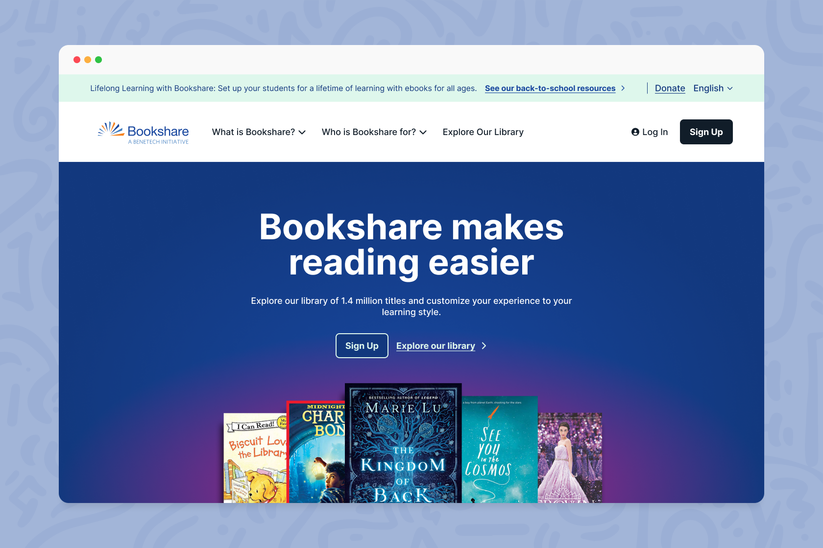
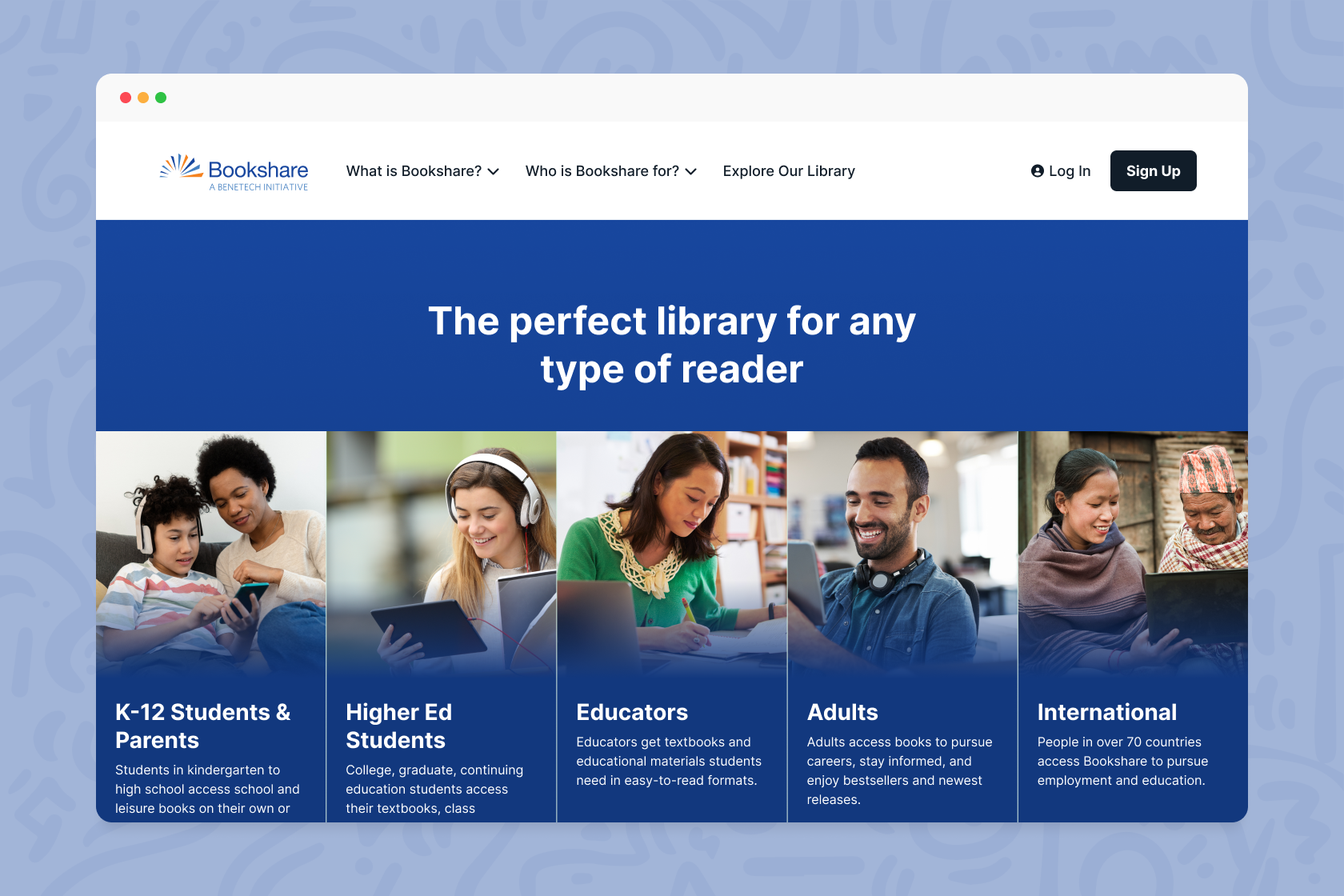
Bookshare is the world’s leading digital library for people with print disabilities, including blindness, low vision, dyslexia, and cerebral palsy, with over 1.4 million e-book titles. Their team was looking for a full redesign of their outdated marketing site and accompanying web app with three goals in mind:
Improve usability and accessibility: Create a more intuitive and accessible user experience and simplified information architecture.
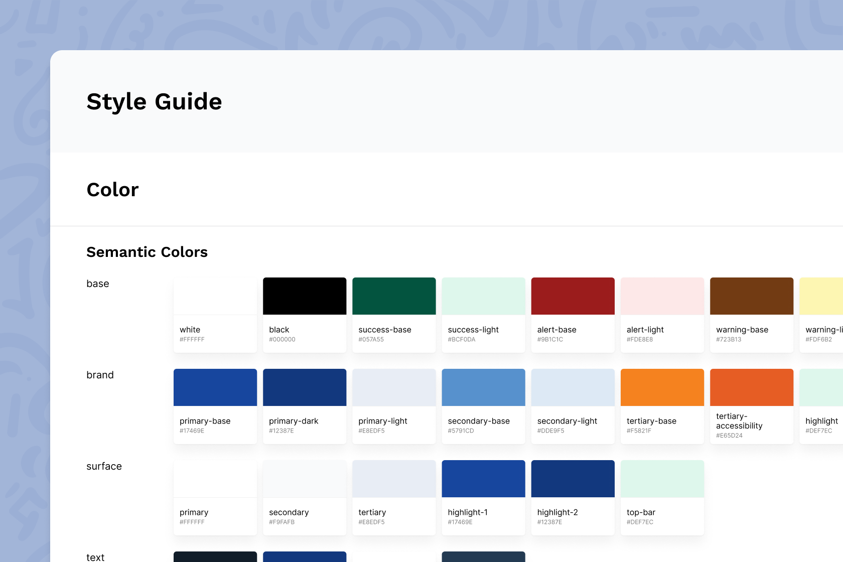
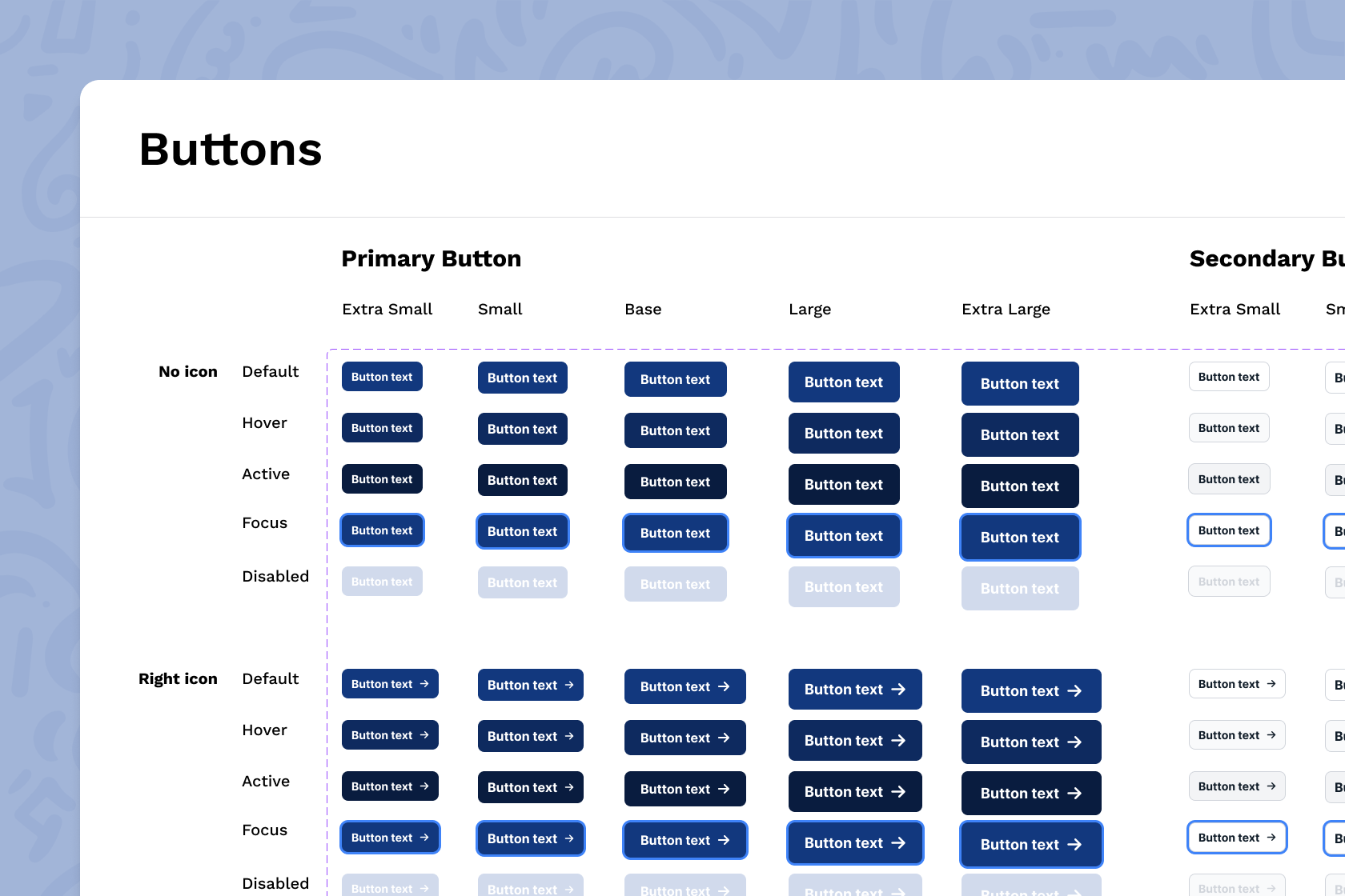
Modernize the design system: Update the visual design and UI to leverage modern design patterns while maintaining a high level of accessibility.
Engage more users: Improve conversion and retention and increase usage of their reading tools.
Approach
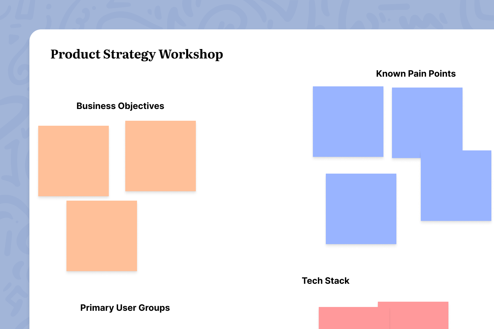
To start, I facilitated a pair of product workshops with the client team. I believe it is critical to approach a new project first by aligning with key stakeholders to identify business objectives and uncover knowns and unknowns. With that information in hand, I then dig into the root problems, grounded as much as possible in real data from real users.
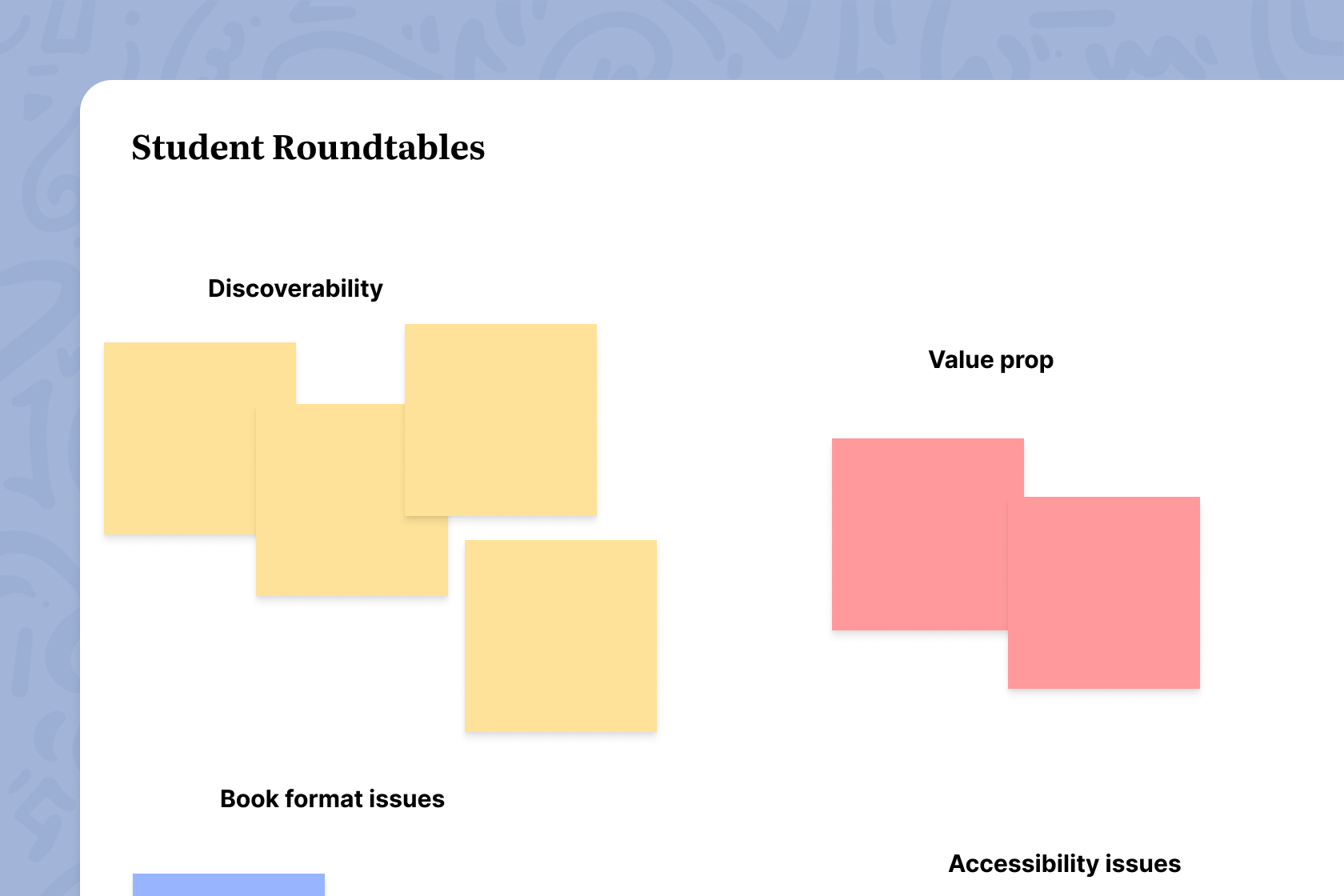
I reviewed all existing research and site analytics. I conducted UX and content audits to assess the current state the site. I co-facilitated user interviews and roundtables with users representing the platform’s many audience groups, from students to parents to educators, to elicit their feedback and hear directly from them what is most important to their experience.
“I do remember my family struggling to [sign up] from what I can remember just because they found it hard and complicated ”
“All these different formats that totally make sense to my visual impaired teachers, but don’t make sense to like an RSP teacher at a high school. They don’t even know what to think in that section, you know.”
“My biggest issue with the website is there’s a lot going on. There’s just so much information and I wish it would be easier to just scroll from one book to the next book.”
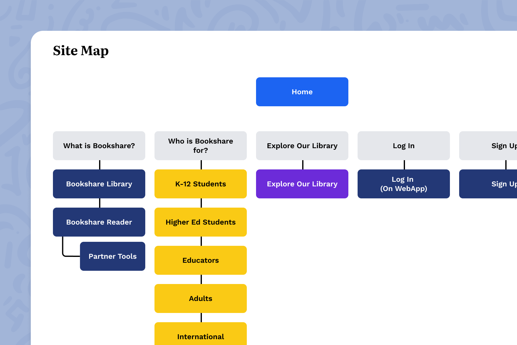
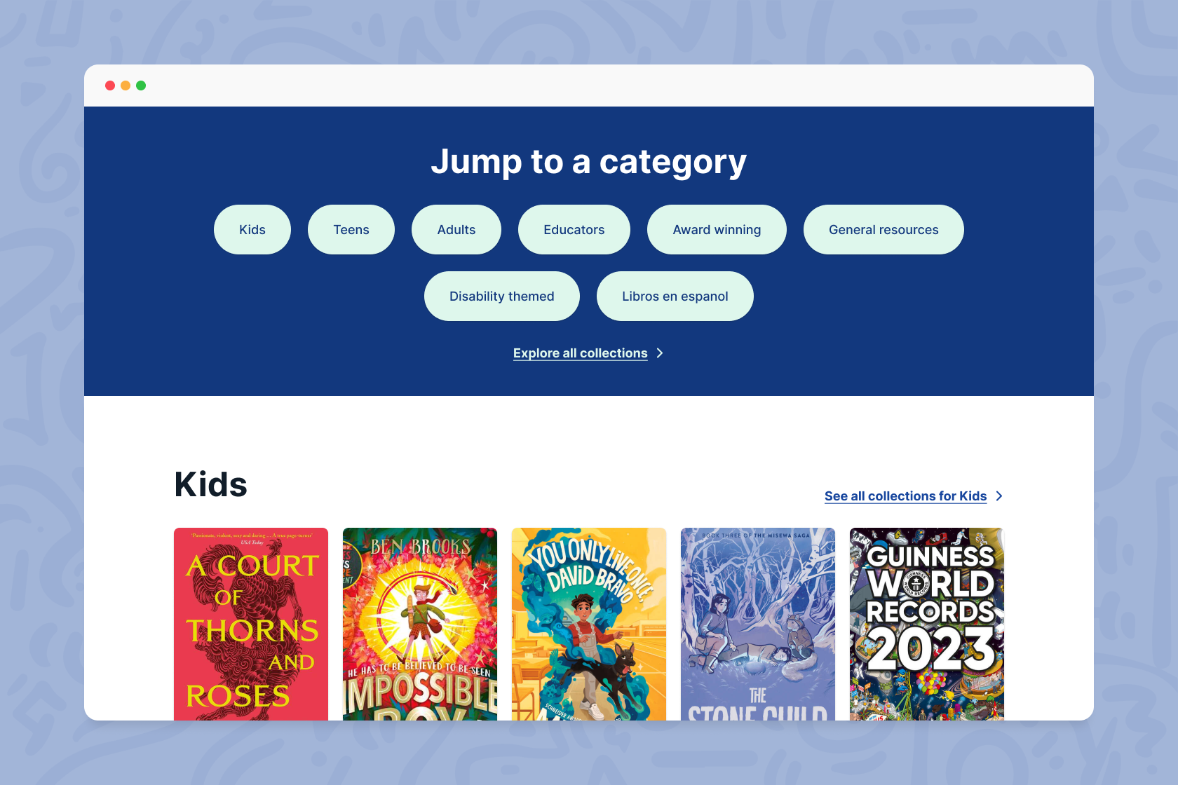
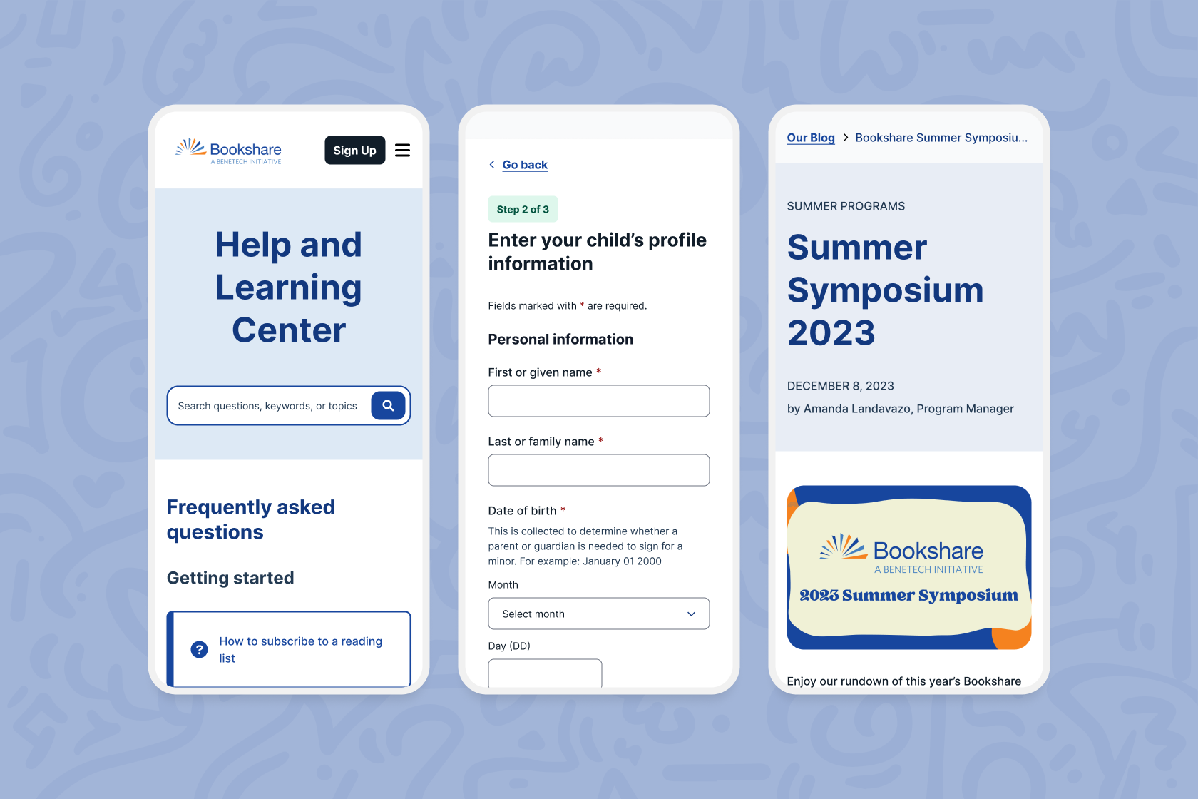
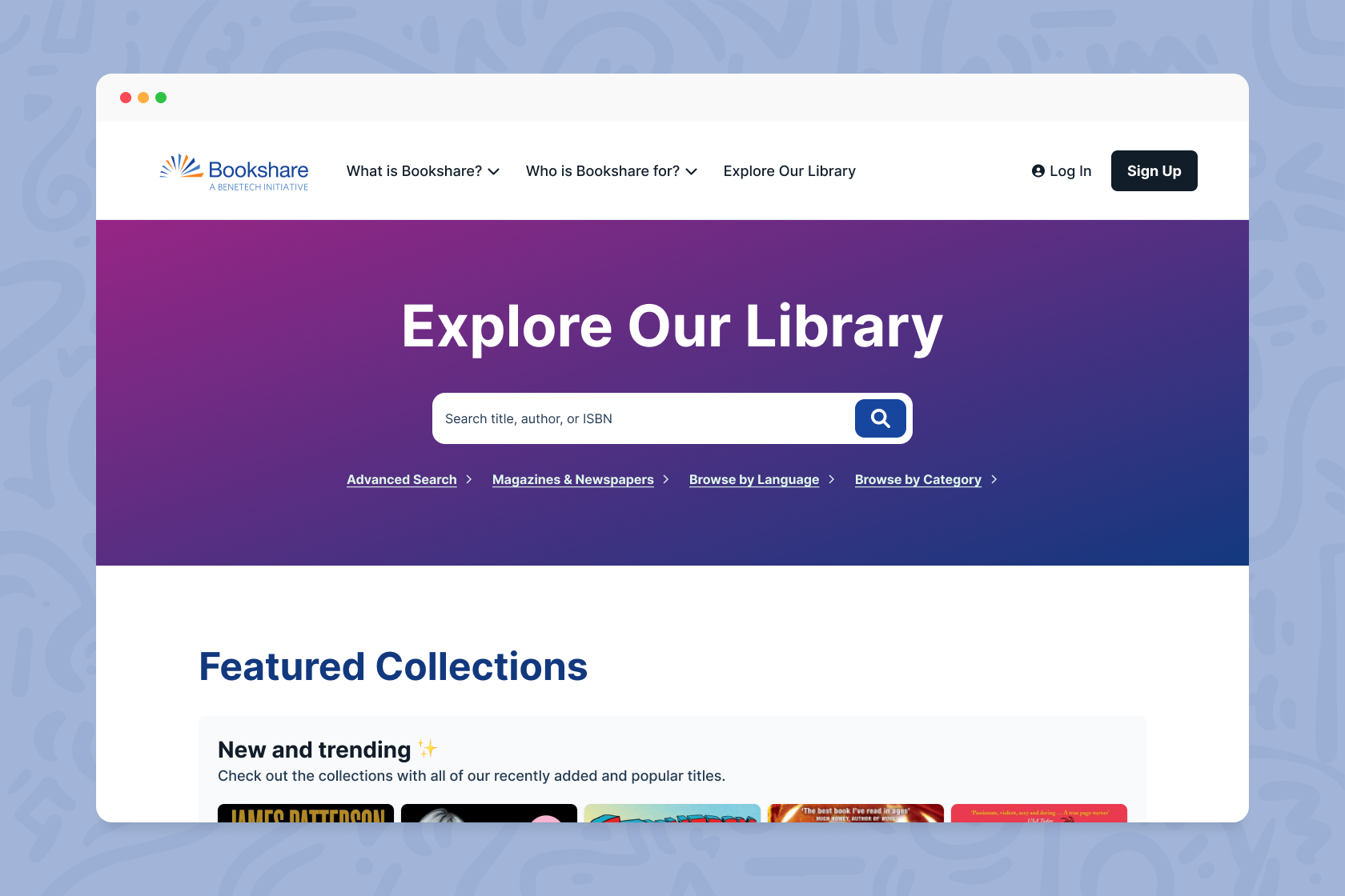
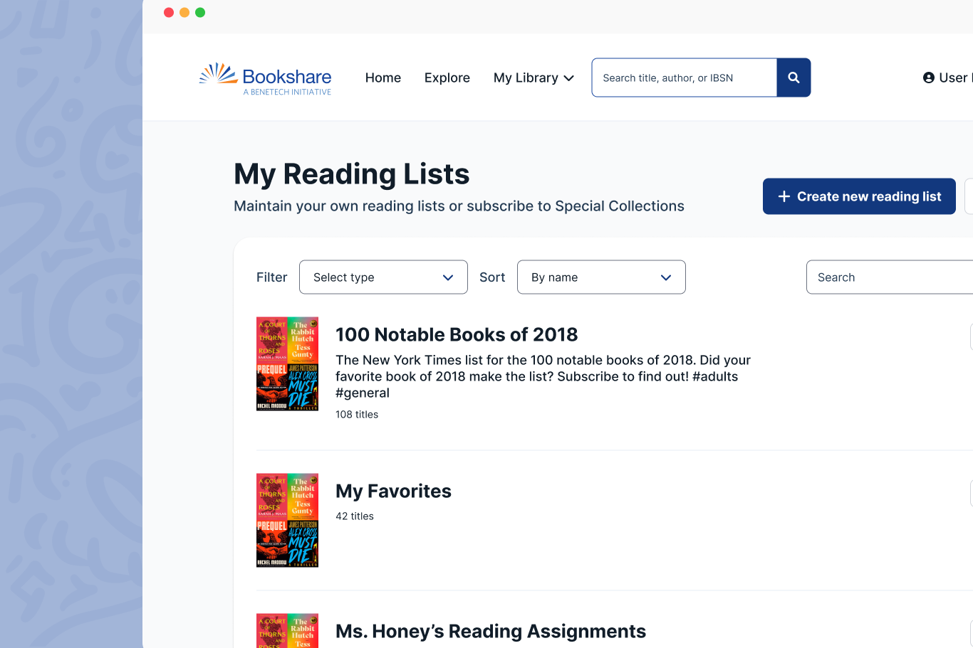
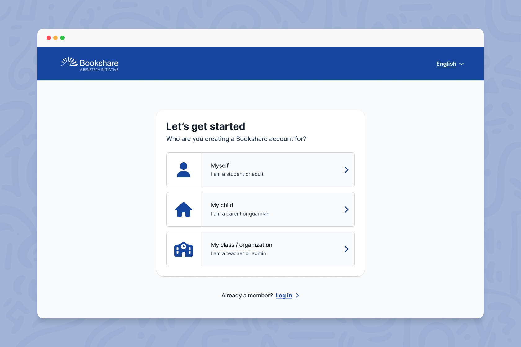
After synthesizing these findings, I identified a number of opportunities for growth. The information architecture was confusing and did not match the mental models for current and prospective users. There were hundreds of pages of redundant content. Users struggled to easily understand and access the different e-book formats they needed. The sign up flow imposed a high cognitive load and was not geared for different audience groups, resulting in a 50% abandonment rate.
After presenting these findings alongside our proposed interventions, we worked with the client to identify the highest impact areas and put together a roadmap that fit within the budget and time constraints we were facing.
Process
Strong partnership was key on this project.
Given that the platform’s core audience were children and young adults with visual impairments, the standard for accessibility was higher than any project I had worked on before. I had to be in lockstep with the engineers on the project as well as our expert partners at LightHouse for the Blind as I worked through design iteration and documentation to ensure we were providing an optimal experience for users who relied on Bookshare to do their schoolwork and access reading material.
On the client side, design and product strategy was evolving in parallel with some crucial business strategy decisions at the company, and it became clear quickly that we could not operate in siloes. Fortunately, by building trust early in the process, I was not only able to get buy-in for my design decisions, but I was able to be a thought partner in those business discussions, which not only served the success of the project, but, hopefully, the long-term growth of the platform.
Impact
Improved access for ~1 million users
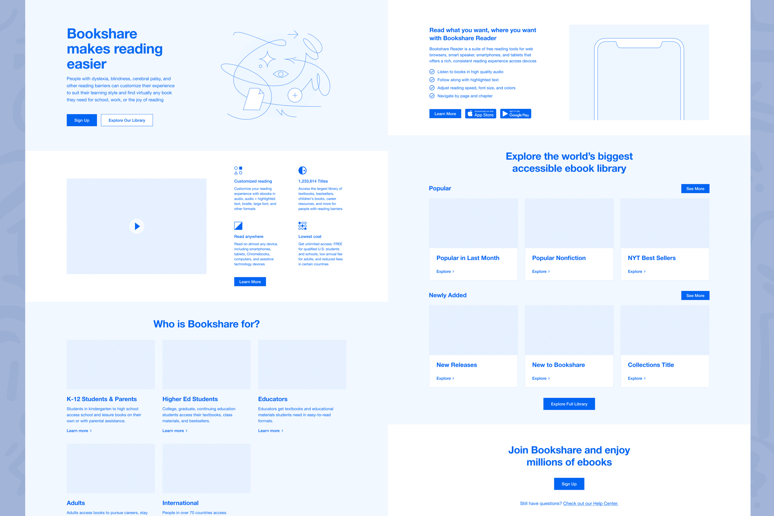
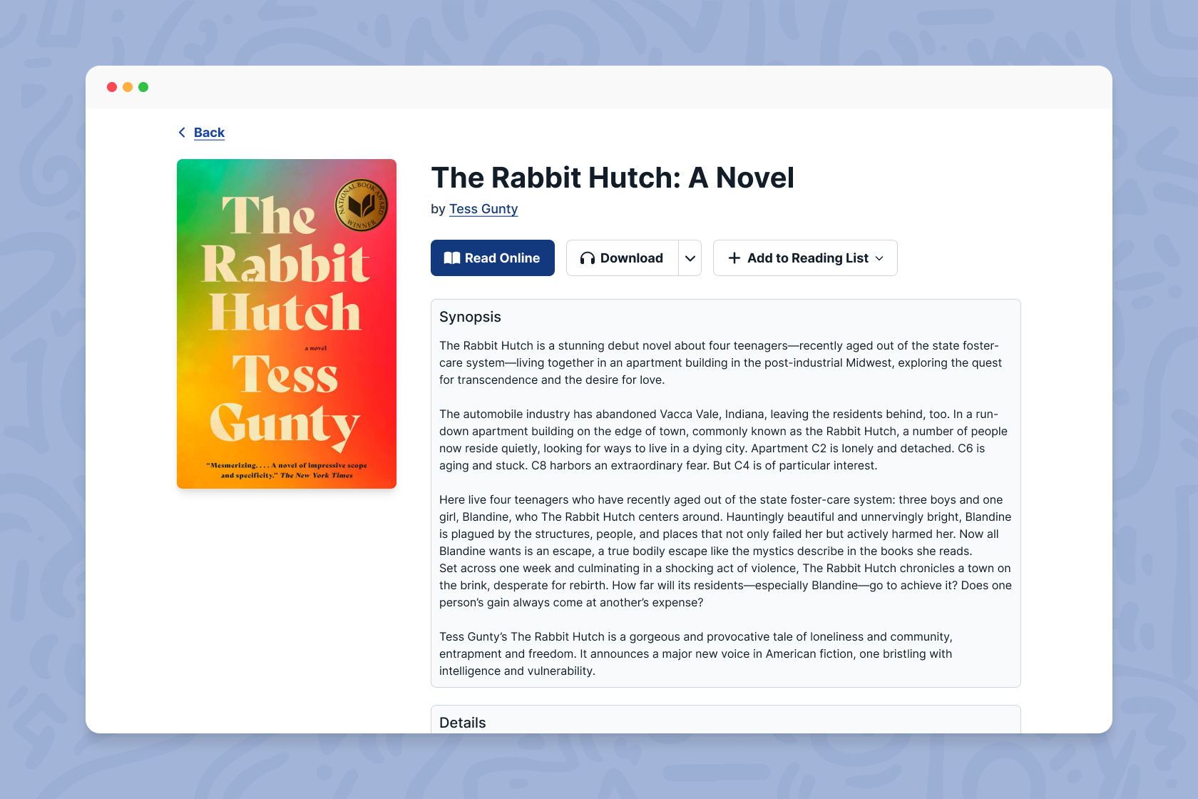
I led a full end-to-end redesign of the marketing site and select web app flows, which provided a more user-friendly and accessible experience for Bookshare’s users with a focus on discoverability.
Built for higher conversion
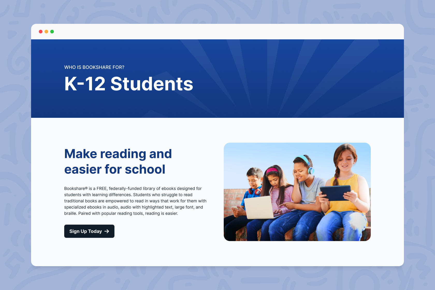
Updates I made to information architecture and content strategy oriented the site towards customer conversion, using language that more effectively spoke to their different user groups. I also simplified the sign up flow to address persisting drop-off issues.
Empowered the client to keep building
Lastly, with budget and time constraints limiting the continued work our team could do, I provided Bookshare with an updated style guide and a new design system that leverages modern UI patterns to empower them to continue scaling our work.